HER Equilibrium Revived
The branding for HER Equilibrium Revived was thoughtfully designed to embody a sense of luxury and elegance while maintaining simplicity. The brand identity blends clean minimalism with luxurious femininity, reflecting the values and aspirations of high end feminine brands.
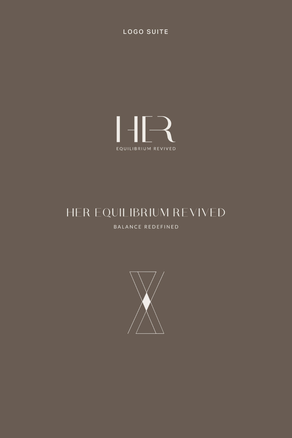
The color palette, featuring refined taupe and stone hues, evokes sophistication and serenity, mirroring HER's commitment to helping women find balance and fulfillment. The primary logo is a sleek wordmark, designed with simplicity in mind to highlight the brand's name.
A distinctive geometric brand mark further reinforces the concept of balance, symbolising the harmony across the four key facets of life. This unique mark serves as a visual representation of HER's core ethos and a signature element of the brand's identity.
design services
BRANDING
LOGO DESIGN
BUSINESS CARDS
BRAND IMAGERY
COLLABORATIONS
PHOTOGRAPHY: Sarah Ellen Photography


